

The week In Crypto In Five Graphs (1/26/19)
The week In Crypto In Five Graphs (1/26/19)
For those who love Crypto & graphs that tell a compelling story

For those who love Crypto & graphs that tell a compelling story
The march to mainstream adoption continues with progress being made all over the place.
1. 2019 — Annual Crypto-Correlations Review
1/22/20, Binance Research (Jonas)

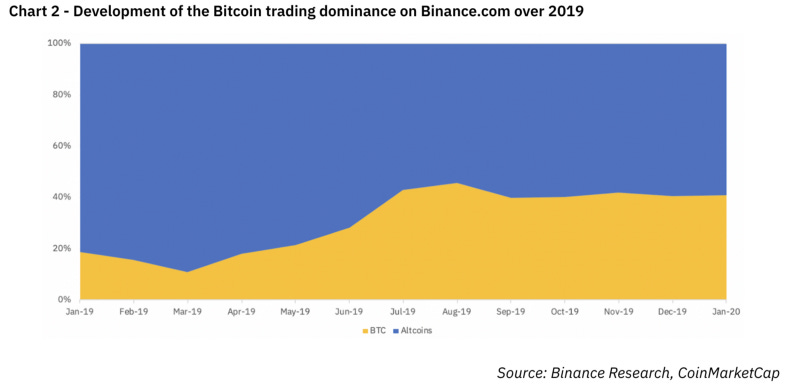
While the majority of the Binance research report focused on correlations in large cap cryptocurrencies, it started with a review of Bitcoin market dominance, as it climbed from 52% to 68% over the course of the year. Interestingly, Binance showed that market cap dominance tracks pretty closely with Bitcoin trading dominance (on Binance):
By the way, Binance continues to kill it as a business:
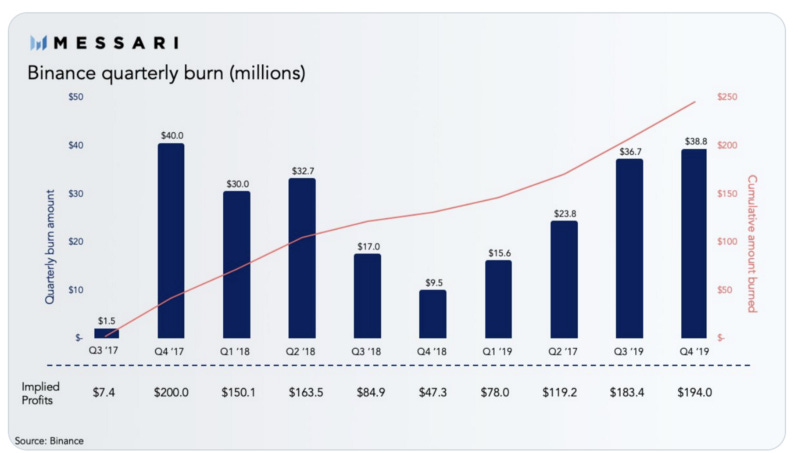
https://messari.io/article/binance-burns-38-million-in-fourth-quarter-nearing-prior-high-from-2017
2. The Year in Ethereum 2019
1/22/20, by Josh Stark & Evan Van Ness

Total Fees Paid to utilize different blockchains
This long, thoughtful, and widely read post states, early on, that “2019 was the year Ethereum grew more confident” . The first graph, which got a lot of play on Twitter, highlighted that “The reality is that there are only two blockchains with significant use: Bitcoin and Ethereum”. Later in the post they showed how individual apps on Ethereum have more paying use than blockchains worth billions.
The other two graphs, highlighted below, reveal the broadening growth in DeFi with the size of the circle corresponding to the amount of ETH locked in the protocol. The first graph below highlights that 2019 started with MakerDAO as the only DeFi protocol with significant assets locked:
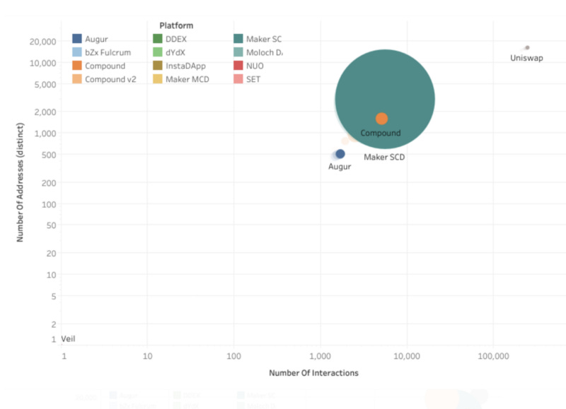
Source: Alethio (01–01–2019 data)
But by the end of the year, the landscape was far more diversified:

MakerDAO is captured in two circles above as it evolves from the original “single collateral” DAI (green) to “Multi-collateral” DAI (yellow). Together they have a combined TVL of 2.15 million ETH, an increase of 16% over the beginning of the year. Meanwhile Compound grew its TVL by 6X, and Uniswap emerged as a force in liquidity, growing TVL by 50X.
3. Investment To Blockchain Startups Slips In 2019
1/22/20, CBInsights
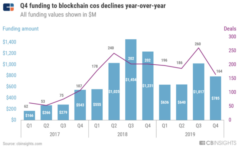
This 48 page report largely tells us that we’re still in crypto winter. While dollars invested in 2019 decreased 28% from 2018’s peak of $4.3B, the number of deals was relatively consistent. In Q4’19, the funding decline accelerated to 36% vs. Q4’18, with investor interest focused on enterprise apps:

China’s saw an even greater decrease in blockchain investments, falling 40% from 2018:
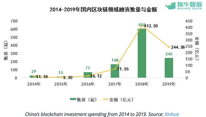
China’s President Xi called for the country to accelerate blockchain adoption in October, so we expect a marked increase in Blockchain investing in China in 2020.
4. Exchange Review December 2019
1/22/20, CryptoCompare
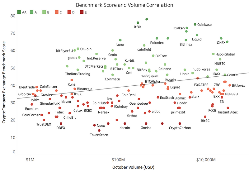
While actually not in the 29 page report, which is chock full of great data/graphs, the graph above reflects CryptoCompare’s Exchange Review which divides exchanges in to “top tier” (green) and “lower tier” (red). CryptoCompare scores exchanges in terms of transparency, operational quality, regulatory standing, data provision, management team, and their ability to monitor trades effectively. The Exchange Review is conducted monthly, which enables CryptoCompare to see where volume is trending:

Notably, lower tier exchanges now represent over 73% of the market today. They’ve gained share over the past year as they’ve implemented new strategies, and as volumes have been falling overall.
5. Despite The Fed
1/21/20, Quantum Economics, Mati Greenspan

The chart shows bitcoin’s correlation to stocks and how the Fed is driving both of them via accommodative fiscal policies. The blue line represents the Dow Jones while the orange is Bitcoin (in log scale). The lines at the bottom (green, yellow and red) show periods of diferent fiscal policy.
Mati posits that stock markets are better conditioned to Fed moves, and thus more correlated to Fed activity than Bitcoin. In other words, if the Fed even hints that they’re thinking of changing the interest rates, stocks react instantly. With crypto, the affects are more subtle. When the Fed is more accommodating, it can take time before those funds find their way into the high-risk markets.
Finally, the chart below highlights how Bitcoin is the only asset with a Sharpe ratio>1 . The Sharpe ratio characterizes how well the return of an asset compensates the investor for the risk taken, and for Bitcoin, return>risk!

If you got .00001 BTC of value from this post please “Clap” below (up to 50 times). Thx!